A box and whisker plot – hey that’s a strange name. It’s a reference to what the plot sort of looks like (vaguely anyways). This type of plot is used when you want to give the reader a good idea of how data is distributed. To show what one looks like, let’s start with some data:
Sponsored Links
11, 23, 14, 27, 8, 4, 31, 22, 17, 19
To plot a box and whisker plot, we need to know the smallest and largest values, as well as the median value, and the 1st and 3rd quartile values. To get these, we’re going to have to order the data:
4, 8, 11, 14, 17, 19, 22, 23, 27, 31
The median value is the middle value, the smallest and largest values are those at either end of the list. The 1st quartile value is the median value out of the lower half of the data, the 3rd quartile value is the median value out of the upper half of the data:
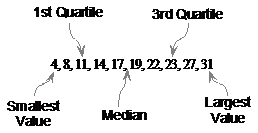
The median value is the average of 17 and 19 – 18. With these found, here’s how we actually draw the plot.
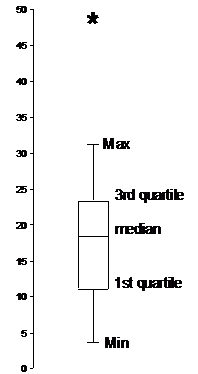
First we need a vertical axis, with a range large enough to cover both the smallest number and the largest number:

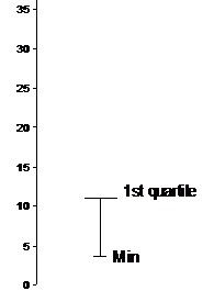
Next thing we do is draw a small horizontal line to the right of this axis, level with the smallest value from the data:
Next draw a vertical line from this point upwards until you get to the first quartile value. Then draw a longer horizontal line:
Now from the first quartile to the third quartile, we extend this part of the plot upwards like a rectangle. We draw horizontal lines at the median of the data and also at the third quartile value, to finish the rectangle:
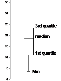
The last step is to draw a vertical line further upwards to the largest value in the data set, and finish it off with another short horizontal line like we started with:
And there’s your finished box and whisker plot. The ‘box’ refers to the central part and the ‘whiskers’ refer to the two vertical lines leading to the maximum and minimum data values.
Outliers in box and whisker plots
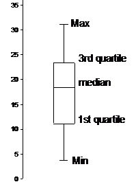
Say the data we’d been given was similar but with one extra value, which was significantly different:
4, 8, 11, 14, 17, 19, 22, 23, 27, 31, 49
Depending on what the data represents and what the presentation is trying to achieve, people may ignore the ‘49’ value because it is so far from the other values which are relatively close together. The 49 is an outlier. Ignoring it can help the box and whisker plot give a more representative idea of the data – the 49 by itself can skew and stretch the plot to create a misleading representation of the data. Instead, it’s usually ignored, and marked on the plot with a special symbol, such as an ‘*’: