A simple exponential relationship has this form:
Sponsored Links
![]()
Exponential graphs can be used to model or describe lots of practical situations. Some of the common ones are growth and decline of a population of animals or humans, or how quickly water drains out of a hole at the bottom of a container.
However, to be able to model many of these situations, we need to make this simple general exponential relationship a bit more complicated. First of all, we can add a coefficient:
![]()
We can also add or subtract another constant term from the ‘x’ in the power, like this:
![]()
And lastly, we can add or subtract another constant term from the whole thing:
![]()
So in this new general exponential relationship, ‘a’, ‘b’, ‘c’ and ‘d’ are all constants. We can get back to our original simple form by making ‘b’ equal to one, and ‘c’ and ‘d’ equal to zero.
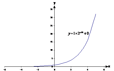
The graph we get when we set ‘a’ to ‘2’ say is this:
Changing ‘a’
![]()
Now, we can make ‘a’ bigger or smaller and see how that affects the graph:
Values of ‘a’ larger than 1 result in graphs that rise upwards as you go from left to right. The larger ‘a’, the more steeply the graph rises up. For values of ‘a’ smaller than 1, the graph slopes downwards going from left to right. The smaller the value of ‘a’ below 1, the higher it will start on the left, and the more steeply it will slope down towards the x-axis before levelling out just above it to the right.
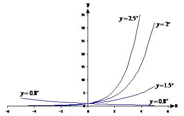
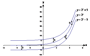
Changing ‘b’
![]()
Changing ‘b’ scales the graph in the vertical direction:
Compared to the ‘b = 1’ line (the middle one), the ‘b = 2’ line is twice as high above the x-axis along its entire length. The ‘b = 0.5’ line is half as high above the x-axis as the ‘b = 1’ line.
It can get confusing telling the difference between graphs where ‘a’ has been changed, and ones where ‘b’ has been changed. The trick is to look at where the lines cross the y-axis. When ‘a’ is changed between different lines, they will still all pass through the same point on the y-axis. When ‘b’ is changed for each of the lines however, each line will pass through a different point on the y-axis.
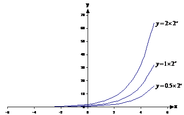
Changing ‘c’
![]()
Having a non-zero value of ‘c’ moves the line horizontally. If ‘c’ is larger than zero, it moves the graph ‘c’ units to the left. If ‘c’ is smaller than zero, it moves the graph ‘c’ units to the right.
See how the ![]() graph is the
graph is the ![]() graph, but shifted one
unit to the left all along the line. Opposite goes for the
graph, but shifted one
unit to the left all along the line. Opposite goes for the ![]() line.
line.
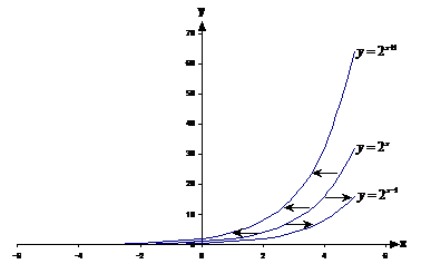
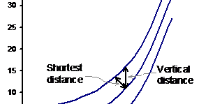
Changing ‘d’
![]()
‘d’ is the easiest one to deal with. If it is positive, the graph is shifted vertically upwards ‘d’ units. If it is negative, it’s shifted downwards ‘d’ units. Easy!
Notice how a vertical gap of 5 units looks a lot bigger when the slope of the two lines is almost flat. When the lines are sloping steeply, it appears that they are closer together, but that’s because your eyes automatically have a tendency to look at the shortest distance between them, rather than the vertical distance between them.
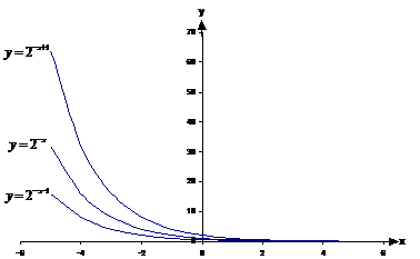
Negative powers
You can also change the graph by putting a negative sign in front of the ‘x’ in the power:
![]()
Doing this flips the graph horizontally across the y-axis:
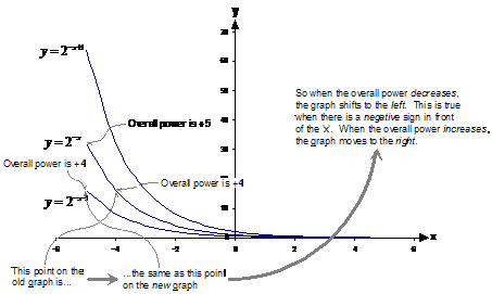
Now how does varying the ‘c’ part now affect the graph? Well, varying c moves the graph horizontally, just like when there was a positive sign in front of the ‘x’. But which way? If ‘c’ is positive, which way does the graph move?
To answer this, think about just ![]() . As you move to the
right of the graph, what happens to the overall power? Well, it gets smaller.
Think about it – when x = –5, the power is +5. When you move one unit to the
right to x = –4, the power changes to +4 – it gets smaller. Therefore as you
move right on a line, the overall power gets smaller.
. As you move to the
right of the graph, what happens to the overall power? Well, it gets smaller.
Think about it – when x = –5, the power is +5. When you move one unit to the
right to x = –4, the power changes to +4 – it gets smaller. Therefore as you
move right on a line, the overall power gets smaller.
So say we start with the graph ![]() , and we want to produce
the graph
, and we want to produce
the graph ![]() .
Let’s pick a point on our graph of
.
Let’s pick a point on our graph of ![]() – say the point at
x = –5. At x = –5, the overall power in
– say the point at
x = –5. At x = –5, the overall power in ![]() is +5. At x = –5
in our new graph, the overall power is +4. So at x = –5 on our new
line, we should plot the point that is at
is +5. At x = –5
in our new graph, the overall power is +4. So at x = –5 on our new
line, we should plot the point that is at ![]() on our old graph of
on our old graph of ![]() . In other
words, we take the old graph and shift it one unit to the left.
. In other
words, we take the old graph and shift it one unit to the left.
|
You may have heard of the saying, ‘breed like rabbits’. Rabbits breed fairly quickly and as such the population of rabbits can increase very rapidly. A famous example of this happened in 1859 in Australia, when a farmer introduced 24 rabbits into his property. It only took about 6 years for these 24 rabbits to multiply to about 22 million (a little more than the current number of people in all of Australia!) We have introduced 2 rabbits (a male and female) onto an island somewhere, with lots of food and no predators. This equation describes approximately how many rabbits there are at any time after we introduced the rabbits: - N is the number of rabbits predicted - t is the time in years since they were first introduced The island can only support about 10,000 rabbits. How long will it take them to reach this population? Draw a graph of the population as it increases to this amount. |
|
Solution |
|
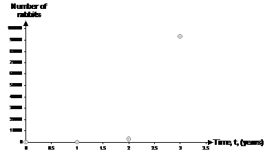
Well, let’s plug in a time, say one year, into the equation and find out how many rabbits we’ll have: So they’re safe for one year. What about 2 years? Getting a lot closer to 10,000. Let’s try 3 years: Yikes! So according to our formula, after 3 years on the island, there would be (if the island could support them) over 93 thousand rabbits. So sometime between the end of the 2nd and 3rd years, the population will reach its limit of 10,000 rabbits. We could get our answer by repeatedly taking a reasonable guess for the time, putting it into the formula and seeing if we get out 10,000, but that could take a while. One other approach would be to draw the graph, and then read the answer off the graph. We’ve already got some points to put on the graph, although one more might be nice – the point for time t = 0: This makes sense – at time zero just as we’ve dumped the rabbits on the island, there are only two – they haven’t had time to breed yet. Now we can plot the graph:
Because the population increases so quickly, the range the vertical axis has to cover is very large. This means the populations for times 0 and 1 appear to just be sitting on the horizontal axis. We need to fit a line through these points that looks like the exponential graphs we’ve plotted before:
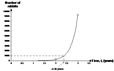
Once we’ve drawn the line through the points, we can draw a horizontal dotted line out from the vertical axis for a population of 10,000 rabbits until it hits the plotted line. Then we can draw a vertical line downwards to the time axis to find how long it takes for the population to reach 10,000 in years. Reading off the time axis intercept we get a time of about 2.35 years. We can check this by plugging it into our formula: Hmmm, not bad. I’d usually spend a bit more time refining my guess. Try t = 2.4: Whoa! Such a small change in the time blew us right over 10,000. I’m going to try 2.38 now: Pretty good, might drop it down just a little to t = 2.3775: That’s good enough for me – our population’s within about 0.3% of 10000. So it will take about 2.378 years to reach the population limit of 10,000. |
The discussion bit about populations
A lot of these questions will ask you to discuss how realistic the formulas are for population growth. In this case you need to talk about the following things:
Deaths. Whatever thing you’re talking about, it will eventually die. Better models take this into account. Death comes to us all in the end…
Limited amount of sustainable food in the environment. If a bunch of rabbits demolish all the green vegetation in an area, this is not sustainable – nothing will grow back and they’ll all starve to death.
Limited amount of shelter and breeding places. This is especially important for animals like birds on rocky islands – there are only so many suitable places to nest.
Predators. If the number of prey animals increases, the predators will do well and they will also increase in numbers and eat more and more of the prey animals.
Disease. As the population gets larger and more crowded, there will be more chance for diseases and other similar things to take their toll.