Sometimes statistical data is presented using 3-dimensional graphs, using cylinders or rectangular prisms to show the data. One thing to be careful of here is not thinking about the volumes of your 3D shapes. For instance, say I was comparing the average housing prices in two different cities, city A and city B, and I found that city B was twice as expensive as city A. Which of the following two presentations is the correct way to show this information?
Sponsored Links
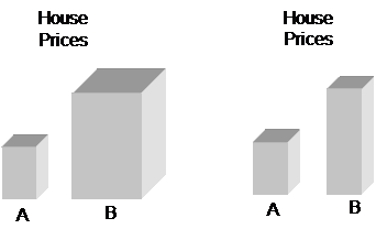
The presentation on the left shows two rectangular prisms, one representing prices of houses in city A and the other prices in city B. The height of the prism representing B is twice as tall. But the dimensions of the square base of the prism are also double the dimensions of the square base of the prism for A. This means that the total volume of the prism for B is actually eight times as large as A. But we’re only trying to represent B being two times as expensive.
The presentation on the right is the way to go. In this presentation, the height of the B prism is twice the height of the A prism. But, the base area of both prisms is the same. So with only the height of B being double that of A, this reflects accurately how average house prices in city B are twice as expensive as in city A.