The techniques talked about so far are all ways of affecting what results you get when you use statistics. However, the way you present the statistics is also important – you can give several different impressions of the same data by presenting it in different ways.
Sponsored Links
Scales on graphs
The value of shares that you invest in can go up or down. Usually, the company will provide a graph showing how the value of their shares has varied over time. Pay very careful attention to what is shown on the axes of the graphs, here are two graphs showing the same data for the value of shares in a company:
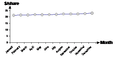
This graph has the y-axis going all the way from $0/share to $25/share. The price of the shares seems to have gradually risen over the course of the year.
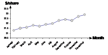
This graph on the other hand has the y-axis starting at $20.5/share going to $23.50/share. Because the y-axis covers such a small range, the line showing the price of the shares seems to go up very steeply. Both these graphs show the same information. But most likely, the company would choose the second graph to show the share price information, because it gives the impression of share prices rising more than the other graph.
There is one justifiable reason for using the second graph however, by using only a small range on the price axis, you are able to see more detail in the line – where it goes up and where it dips down. In effect it’s like zooming in on the graph.
Missing scales on graphs
Even worse is when you don’t have numbers on the scale of a graph. For instance, how about this graph of the price of a loaf of bread:
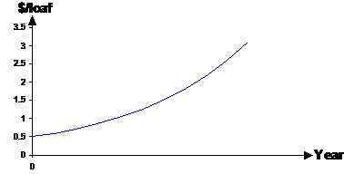
Someone could try and make a statement like “the price of bread is increasing at a very rapid rate” using this graph. However, there is no way you could justify making such a comment, without having values on the year axis. We don’t know whether this graph shows the variation of prices over one year, or over thirty years! If it’s the variation in price over 30 years, then that’s really not a very rapid increase in price at all – an average of only about 9 cents increase per year.
Using the wrong measure
Sometimes you can misrepresent data by using the wrong choice out of the mean, median and mode. Say there was a new apartment block being built where the 9 units in it were going to be sold for these amounts:
|
Unit 1 |
$300,000 |
|
Unit 2 |
$300,000 |
|
Unit 3 |
$300,000 |
|
Unit 4 |
$300,000 |
|
Unit 5 |
$320,000 |
|
Unit 6 |
$700,000 |
|
Unit 7 |
$700,000 |
|
Unit 8 |
$1,200,000 |
|
Unit 9 |
$1,200,000 |
Usually developers are interested in making the costs appear cheaper than they actually are, to draw more people in. Let’s compare the three main statistical measures for this data:
Mean = $591,000
Median = $320,000
Mode = $300,000
Now, the mode isn’t usually used in this sort of area, but the mean and median are both statistics which can be quoted. Guess which one the developer’s probably going to use – the median, because it’s $270,000 less than the mean.
Using the median price in this case gives a misleading impression of the unit prices. Even if you go for the cheapest unit in the whole apartment block, it’s only $20,000 less than the median price. But the units above the median price start at more than double it.