Extrapolation is all about estimating data points outside the range of your current data. You can remember this from the ‘extra’ part of the word – ‘extra’ in this case means ‘more’ or ‘extra’ – ‘extra’ data on top of what we currently have. Our height-weight graph only has weights for people from 150 to 200 cm tall. What if we wanted to find the average weight of people 220 cm tall? We could use extrapolation to calculate what their average weight might be. To do this we need to extend the current line we’ve plotted to the right so it goes all the way to 220 cm on the height axis.
Sponsored Links
How do you extend the line? Well, that can sometimes be quite tricky. Because you don’t have any actual information about how weights of people change when you go above 200 cm in height, you’re really making an educated guess by extending the line. Usually, you try and continue the trend in the line. For instance, from 180 to 200 cm the average weight of people has been increasing pretty steadily, so you can extend the line to continue this trend.
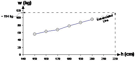
Once you’ve extended the line, all you need to do is trace up from the 220 cm mark on the height axis, and then sideways across to the weight axis. From our graph, the extrapolated average weight for a 220 cm tall person is around 114 kg.
Problems with extrapolation
Extrapolation is generally less accurate then interpolation. When you do interpolation, you’re estimating the value of a point between two known points.
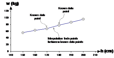
Extrapolation on the other hand – you’ve only got known data on one side. You’re guessing at the relationship between the two variables (height and weight in this case) when you extrapolate the line further to the left or right:
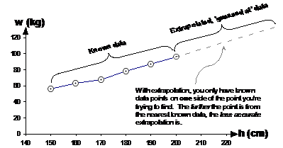
This problem with extrapolation becomes much more obvious when you have more complicated graphs, such as this one:
It’s hard to work out what the trend is at the right hand side of the graph. There could be several trends there:
· The graph is straightening out to a straight line in a slightly downwards direction
· The graph is slowly starting to curve back upwards
· The graph is starting to curve back upwards, more and more so as you move to the right
Quite often in an extrapolation question the last part of the question will ask you to discuss the accuracy of the answer you’ve just found. This is where you need to discuss how by extrapolating you’re guessing at the trend in the current data, and extending the graph based on this guess.
Extrapolation also becomes more and more inaccurate the further you extrapolate. If you’re extending a line on a graph only a little bit, chances are that you’ll get it somewhat right. You can’t really extend the graph a long way without more information about the data and trends however. A good example of this is how quickly a plant grows depending on how long you water it each day.
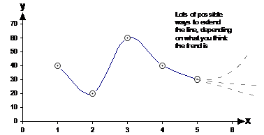
If you don’t water a plant at all, it’s going to die very quickly. If you water it a little bit, it might just survive, but not very well. If you increase the amount of water, it will get healthier, and grow more quickly. However, there is a limit to how much water is good – you can over-water a plant and actually retard its growth or even kill it. The graph for plant growth rate versus watering time each day might look something like this:
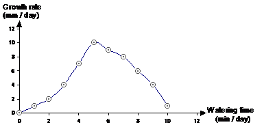
Notice how there is an optimal amount of watering for fastest plant growth. Now, what if we’d only been given data for watering amounts up to 4 minutes per day? Say we wanted to find the growth rate for 6 min / day and 10 min / day of watering. How could we do it? Well, we could plot the graph for our known data (up to 4 minutes of watering per day), and then extrapolate to find the growth rates for 6 minutes and 10 minutes of watering per day.
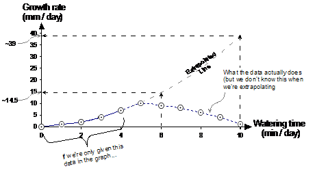
The line you get when you plot the known data has an upwards slope, with the slope gradually getting steeper as you move from left to right (shown by the solid line in the graph). When we extrapolate this line further to the right, we continue the line in this upwards manner, since all we’ve got to go on is the information in the known data. The extrapolated line is shown by the thick dotted line continuing upward and to the right. For comparison, I’ve also put in a line showing how the growth rate actually varies in reality.
This example shows how extrapolation doesn’t always work, and also how it gets worse as you extrapolate further from your known data. For instance, if we compare the predicted growth for 6 minutes of watering a day to what it actually is supposed to be:

This is a sizable error, but is nowhere near as bad as for the extrapolated prediction for 10 minutes of watering a day: