A histogram looks a bit like a column graph, but is not the same. It is used to show the data in a frequency table in a visual manner. You can go straight from the table to drawing a histogram. Let’s use the maths exam marks table:
|
Sponsored Links |
Frequency |
|
1-5 |
1 |
|
6-10 |
5 |
|
11-15 |
8 |
|
16-20 |
6 |
There are 4 classes, so we’re going to have 4 columns in our graph. Because our classes are all the same, each column is going to have the same width, although they’re going to be different heights. The height of each column needs to line up with the correct frequency on the vertical axis of the graph:
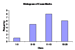
Notice how there are gaps between the columns. The gaps tell the reader that the marks are a discrete variable. This means that you can only have certain values for a mark – you can’t get a mark of 8.3210 for instance.
A continuous histogram
Say you were looking at the weights in kilograms of players in your football team. You might have created a frequency table like this:
|
Weight Class |
Frequency |
|
40 – 49.99 |
4 |
|
50 – 59.99 |
7 |
|
60 – 69.99 |
11 |
|
70 – 79.99 |
8 |
Unlike a mark on an exam, the weight of someone is a continuous variable – it can be any value whatsoever. You can be 45.69 kg, or 74.35 kg. Your weight is not restricted to only whole number values. This means you should plot your histogram with no gaps between the columns:
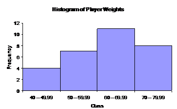
Once again, since the classes are all the same width, all the columns are the same width. The class that each column represents is shown below the column on the class axis.
Look at the two classes ‘40 – 49.99’ and ‘50 – 50.99’. Where would I put a weight of 49.9999 kg? It doesn’t seem to fit into either class, it’s larger than 49.99, but it’s smaller than 50. Well, when we right something like 40 – 49.99, we usually really mean something like 40 – 40.99999999999999999… except we can’t be bothered writing all the digits down. In other words, we mean any number that is 40 or larger, but smaller than 50, goes into this class.