Trends are overall characteristics of which ‘way’ the data is heading – for instance whether the quantities are in general increasing or decreasing. This ‘in general’ bit is very important – a trend just shows your overall or general impression of what the data is doing – it doesn’t have to be precisely correct for every single piece of data.
For instance, if we look at the time that Jason is staying in bed after his alarm over the days, are there any trends we can observe (see the previous line graph section)? Well, every single day Jason spends more time in bed than the previous day, except for one day (day 4), when he spends less time in bed than the day before. But on days 2, 3, 5, 6 and 7 Jason spends more time in bed than the day before. This is enough evidence to say that there is a trend present, which is:
Sponsored Links
The amount of time Jason spends in bed after his alarm goes off is increasing.
Extrapolating
Extrapolating a line graph is what happens when you extend the line graph in either direction, to the left or to the right. Think of it as ‘extra’ + ‘polation’ – the ‘extra’ describes how you’re ‘adding on’ to the sides of the graph.
Extrapolation is used to try and predict data outside of the data you’re given. We can show extrapolation using the example of Jason sleeping past his alarm. We have 7 days worth of data about Jason’s waking habits. We might want to extrapolate and try and work out how long Jason might stay in bed past his alarm on day 10. We only have information up until day 7. So we need to extend the line graph all the way to day 10:
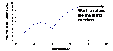
How do you extend the line? That’s the magic question! There is no absolute correct way to do this. One way is to look at the data near the point where you’re extending the graph to see whether it has a trend or not. For instance, we’re extending our graph from day 7 onwards. What does the data look like before day 7?
Well, from day 4 to day 7 the time Jason is staying in bed is increasing, from 3 to 6 to 8 to 9 minutes. So we’re probably going to need to extend the line in an upwards direction.
There’s a more subtle observation that you can make about the data leading up to day 7. The time that Jason stays in bed is increasing. But the amount it increases each day seems to be decreasing. Between day 4 and day 5 it increases by 3 minutes. Between day 5 and day 6 it increases by 2 minutes. And between day 6 and day 7 it only increases by 1 minute.
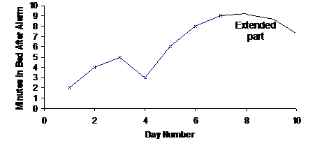
So here’s one way you could extend the line:
There’s more than one way to skin a cat
Now, one of the tricky things about extrapolation is that different people will ‘see’ different trends in the data. Also, when you look for trends, any trend you see will have a region where the trend is true. For instance, this graph has an overall trend of increasing, even though there is one point where it decreases. But it also has local trends, which are trends in one part of the graph. In the previous graph, we used the trend from days 4 to 7 as a basis for how we extended the line.
But you could also have used the overall trend as a basis for extending the graph, which is just that the line was going up. In that case, you’d get a graph looking something like this:
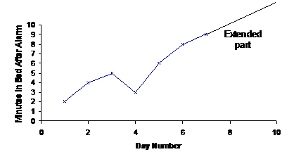
Notice how different extending the line in this way is compared to what we did earlier. Which way you pick to extend the line when you extrapolate isn’t as important as justifying why you extended it in that way. So for the first graph, you might say something like:
Based on the trend from days 4 to 7, which indicates that Jason’s stay in bed time is increasing, but increasing by a smaller amount each day, the line was extended in this way.
If you were justifying the extension in the second graph, you might say something like this:
Based on the overall trend in the graph, which is an increasing trend, the line was extended in an increasing manner corresponding with the average increase of the existing line.