Line graphs are a very, very common type of graph which are used everywhere. They are used a lot to show how something is changing over time, and can even be used to predict the future (carefully). The can also show trends. A trend is the general direction in which something is heading or tending towards. For instance, the population of the world has a trend – it is increasing.
Line graphs usually have two axes, and are in some ways similar to a column graph, except that a line is used instead of columns. A line graph usually has a horizontal axis which shows categories or time. They also have a vertical axis which usually shows a quantity. The big thing about line graphs is that adjacent (next to each other) categories on the horizontal axis have to be somehow linked to each other. For instance, in one line graph I might have this on the category axis:
Sponsored Links
The categories in this case are the months of the year. This is an example of a line graph where the category axis is time, which is very common. Now look at say the month of June. On one side of it is May, and on the other is July. June is linked to both May and July because they are the months immediately before and after it in a year. This is what we want in a line graph – the category labels are linked to each other. But say we had a category axis like this:
This wouldn’t make sense, because some of the categories aren’t linked to the ones on each side of them. For instance, if you look at April, before it there is October, which is nowhere near April. After it there is February, which is also not next to April in a year. To make more sense, we’d have the months in the order that they occur.
Drawing a line graph
I’m going to use an example which should be familiar to you all – getting up in the morning! Jason is a school student whose alarm goes off at 6 am every morning to get him out of bed. However, he’s usually pretty sleepy and tends to stay in bed “just a little longer”. Once he gets out of bed, it usually takes him about 45 minutes to eat breakfast, get changed and get to the bus stop. Jason’s bus leaves from his bus stop at 7:00 am every day. Here’s some data on how much longer Jason has been staying in bed after his alarm has gone off:
|
Day |
1 |
2 |
3 |
4 |
5 |
6 |
7 |
|
Minutes in bed after alarm |
2 |
4 |
5 |
3 |
6 |
8 |
9 |
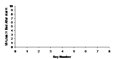
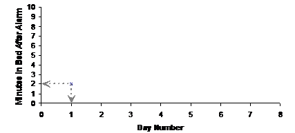
To draw the graph, we need to decide what the category axis is going to show. For this data, the category axis can show the day number – 1, 2, 3 etc… What about the quantity axis? Well, the thing being measured here is the time that Jason stays in bed after his alarm goes off – so this can be our quantity axis. So our bare bones graph will look like this:
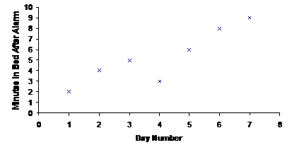
Now we need to put some of the actual data onto the graph. For each of our categories (the day numbers), we need to show how long Jason stayed in bed after his alarm (this is the quantity, measured in minutes). For instance, on day one, Jason stayed in bed for 2 minutes after his alarm. We can mark this on the graph by plotting a point above the day number 1 tick mark, and level with ‘2’ on the quantity axis:
Notice how the point lines up with the day ‘1’ category on the horizontal category axis, and lines up with the quantity ‘2’ on the vertical quantity axis. You can do the same for the rest of the data, plotting points at the correct locations on the graph:
Okay, so now all the data is on the graph. However, there aren’t any lines on the graph yet – and it is meant to be a line graph! So where do the lines come in? Well, one way you can put lines on the graph is to draw a straight line between each point, like this:
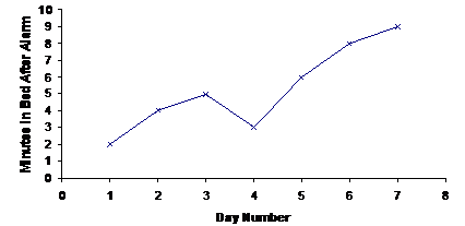
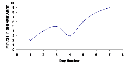
This is one of the most common ways to draw a line graph, although you can do other things like fit a slightly curvy line to the graph: