Back at work, Sandra is starting to write up her article on the upcoming election. She needs some way of showing what the current attitude of the voters is in the article. She could put the table in the article, but having numbers isn’t always the best way of presenting statistical information. Often, there are more graphical or visual ways which make it a lot easier for the reader to get an idea of the general situation. Sandra decides to try a few different presentation techniques.
The pie chart / sector graph
This one’s a pretty common way of presenting data. Basically, you draw a circle, and split it up into wedges, with each wedge representing a category in your statistical problem or survey. For Sandra’s problem, each wedge would represent a candidate. The size of the wedges indicates the quantity associated with that wedge. For Sandra’s problem, the size of the wedge would indicate how many votes that person got in her survey. So Bob would have the biggest wedge, and Tom the smallest.
Sponsored Links
To draw the pie chart, you need to know what fraction of the total votes each candidate got. To work this out, you need to work out how many votes were collected in total for all the candidates:
![]()
Next thing to do is work out what fraction or percentage of the votes each candidate received. You can do this by dividing the number of votes they received by the total number of votes:
|
Candidate |
Fraction of Total Votes |
|
Bob |
|
|
Jane |
|
|
Sally |
|
|
Tom |
|
How do we use these fractions or percentages? Well, if you rotate around a circle completely, you will have rotated through 360°. We need to draw wedges representing the fraction of votes each candidate got. Bob got 0.4 or 40% of the total vote, so he needs a wedge which takes up 40% of 360°. 40% of 360° is about 144 degrees – this is the size of Bob’s wedge. You can do the same for the other candidates. I’m going to use the original fractions so I don’t have rounding errors:
|
Candidate |
Wedge Angle |
|
Bob |
|
|
Jane |
|
|
Sally |
|
|
Tom |
|
If you’ve got time, it’s a good idea to check your angles add up to close to 360°. In this case:
![]()
If they don’t add up to 360°, you will need to go back and check through your working to see if you’ve made a mistake.
Now you can split a circle up into wedges with the correct size. You may need to use a protractor to measure out the right angles for each wedge:

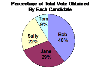
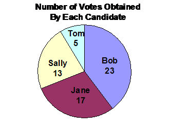
This diagram shows the wedges for each of the four candidates, and the angle of the wedge. The angle is something we calculated just to help us draw the pie chart accurately so each wedge was the right size. It has nothing to do with the actual information we’re trying to tell anyone who looks at the chart. For this survey, there are two interesting statistics someone might be interested in:
· The percentage of the total vote each candidate got
· The actual number of votes each candidate got
You could draw a pie chart showing either of these. It’s important to give the pie chart a title, so people know what the numbers on the pie chart mean:
Bar and column graphs
Bar and column graphs represent data by using, guess what, bars or columns! What’s the difference between a bar and a column? Well, it’s just a matter of orientation. Bar graphs are horizontal graphs – the bars go sideways across a page. Column graphs have their columns vertical – they go up the page.
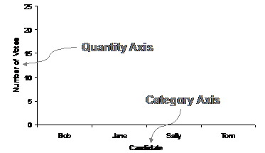
Let’s work with making a column graph to present our data. The graph has two axes. The horizontal axis shows the different categories in the statistical problem – in our case, the different candidates people could vote for. The vertical axis shows the quantities of the things we’re counting or surveying – in this case, the votes for each of the candidates.
So to make a basic column graph, all we really need is the information in this table, we don’t need percentages or any of that stuff:
|
Candidate |
Total votes |
|
Bob |
23 |
|
Jane |
17 |
|
Sally |
13 |
|
Tom |
5 |
All we need to do is set up the axes, with categories on the horizontal axis, and quantities on the vertical axis:
So this is the basic structure of the graph, now all we’ve got to do is draw in the columns. Let’s start with Bob. Bob had 23 people say they would vote for him in the survey. This means we need to draw a column above the ‘Bob’ on the category axis which is 23 votes tall:
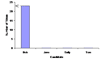
People often colour in or shade the column like in this graph, rather than just leaving it as an outline. Notice how the top of the column lines up with 23 on the ‘number of votes’ quantity axis. You can do the same thing for the three other candidates. Your final graph should look something like this:
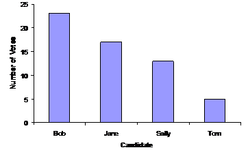
For many people, looking at a graph like this gives them a much better idea about the information presented in it, compared with just looking at a table with numbers in it. For instance, looking at the graph, you can immediately make all sorts of qualitative observations. A qualitative observation is something which doesn’t involve exact numbers or quantities. For instance, I could say things like:
· Bob has almost twice as many votes as Sally
· Tom has less than half as many votes as Sally
· The gap between Bob and Jane is similar to the gap between Jane and Sally
These are all qualitative observations, which can be made pretty much as soon as you see the graph. It’s not always as easy to make these sorts of observations when you’re just looking at a list of numbers in a table.
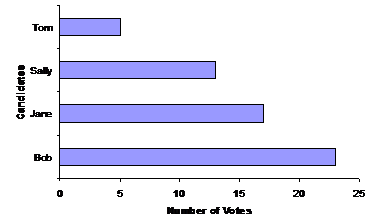
Bar graph
A bar graph’s basically the same as a column graph, except that it has its two axes swapped over, which means that the columns become horizontal bars. Here’s what a bar graph would look like for the vote data: