Often you’re asked to “fit a line” to some points on a graph. Now, this by itself isn’t enough information to go off – there are an infinite number of lines you can draw, straight ones, curved ones, squiggly ones, all sorts! So usually the question will ask you to fit a certain type of line to the points. For instance, what type of line do you think would be most appropriate for the graph we just plotted? How about a straight line?
Well, we can try drawing a straight line so that it goes through all the points on our graph, like this:
Sponsored Links
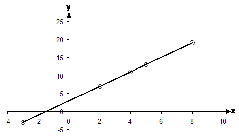
For this graph, it’s pretty easy to draw a straight line that goes through all the points. You’re best off using your ruler to do this.
Remember that the points on this graph came from a relation. When you can draw a straight line through all the points of a relation, it’s called a linear relation. It’s important to be able to recognise whether a relation is a linear one or not. You can do this a couple of different ways.
One way is to plot the relation on a graph and see whether you can draw a straight line through it. This way works, but it takes some time to come up with the points to put on the graph.
The other way is to look at the rule or equation that is used in the relation.
If the relation is linear, both x and y are raised to the power one. You can also have linear relations which only have x or y, but not both. The x or y still has to be raised to the power 1 though.
So what do I mean by, “raised to the power one”?
Well, this means they can’t be squared, like x2. They also can’t be
square rooted, like ![]() . So only ‘x’ is OK.
. So only ‘x’ is OK.
Same goes for y – y is ok, but y2, or ![]() isn’t.
isn’t.
Take ![]() for instance. Is this a linear
relation? Well, first of all, it’s only got ‘x’ in it, no ‘y’. That’s OK.
Now what about the x – it’s fine because it’s not square rooted or squared or
anything else. It’s raised to the power 1.
for instance. Is this a linear
relation? Well, first of all, it’s only got ‘x’ in it, no ‘y’. That’s OK.
Now what about the x – it’s fine because it’s not square rooted or squared or
anything else. It’s raised to the power 1.
Then you could have something like ![]() . This has both
‘y’s and ‘x’s in it. The y is fine – it’s raised to the power one which is
OK. But the ‘x’s aren’t – one of them is ok, but another one is squared –
raised to the power 2. This means that this relation is not a linear
one. To convince yourself, you could also try plotting this relation. To do
this, we first need a set of domain values, we can pick something like the values
between –5 and 5. We put this into a table:
. This has both
‘y’s and ‘x’s in it. The y is fine – it’s raised to the power one which is
OK. But the ‘x’s aren’t – one of them is ok, but another one is squared –
raised to the power 2. This means that this relation is not a linear
one. To convince yourself, you could also try plotting this relation. To do
this, we first need a set of domain values, we can pick something like the values
between –5 and 5. We put this into a table:
|
–5 |
–4 |
–3 |
–2 |
–1 |
0 |
1 |
2 |
3 |
4 |
5 |
|
|
|
|
|
|
|
|
|
|
|
|
So we’ve got the domain values in the top row of this table. Now we need to use the equation or rule to work out the range values, which go in the bottom row of the table. So for example, for the first range value, the domain value is ‘–5’. So we need to put ‘–5’ into the equation as ‘x’. Remember that the domain values are like ‘x’s and the range values are like ‘y’s:
So we can put 28 into the box below the ‘–5’. Now we just need to fill out the rest of the table in the same way:
|
–5 |
–4 |
–3 |
–2 |
–1 |
0 |
1 |
2 |
3 |
4 |
5 |
|
28 |
15 |
6 |
1 |
0 |
3 |
10 |
21 |
36 |
55 |
78 |
Final thing to do is just plot the points on a graph:
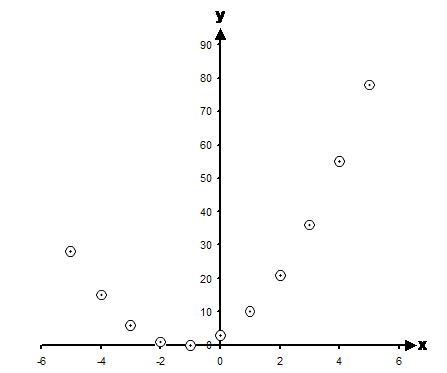
Now there is no way we can draw a single straight line which will go through all of these points. So this confirms that this is not a linear relation.
Choosing a suitable scale for a graph
One of the tricky things about drawing graphs is making them fit nicely. Sometimes on an exam you may only have a small amount of space to draw a graph. There are good ways and there are bad ways to present a graph on a page. Here’s a bad way:
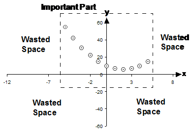
Look at all the wasted space in this graph! If you drew a graph like this there would be several ways you were making life difficult for yourself. First of all, you haven’t used the available space well, meaning that the area where you plot the points is only a small fraction of the whole area available to you. This makes the points smaller and harder to read for the marker. It also makes it harder for you to draw the points at the exact right position.
So before you draw a graph like this, have a look at the domain and ranges:
|
x |
–5 |
–4 |
–3 |
–2 |
–1 |
0 |
1 |
2 |
3 |
4 |
5 |
|
y |
55 |
42 |
31 |
22 |
15 |
10 |
7 |
6 |
7 |
10 |
15 |
The domain is the top row of numbers. These are the ‘x’ values. What you want to do is find the smallest and largest number in this row. The smallest number is ‘–5’. The largest number is ‘5’. This tells us how wide we need to make our x-axis. The x-axis needs to go from around –5 to 5. For a bit of margin, let’s make it a little bit wider than we need and go for –6 to 6. So we can now draw our x-axis:
![]()
Now we need a y-axis. To work out what this is going to look like we need to look at the range, which is the bottom row in this table. Once again, we need to look for the smallest and the largest number. The smallest number is 6. The largest number is 55. This means that our y-axis needs to be between 6 and 55. Now usually it’s good if the y-axis and x-axis cross over each other, so let’s run our y-axis a little lower than 6. Let’s draw the y-axis going all the way down to 0 and crossing the x-axis:
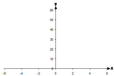
I’ve also allowed a bit of margin above 55, and have drawn the y-axis going all the way to 60. Now all we have to do is plot our points on the graph, and we should get this:
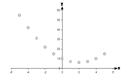
Notice how there’s much less wasted space in this graph. The points spread across the full lengths of both the x-axis and the y-axis. This makes it easier for us to draw the points exactly where they should be and makes it easier for anyone reading it as well.