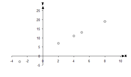
The Cartesian plane is perfect for drawing relations. Relations are made up of two parts, the domain and the range. When we draw a relation on the Cartesian plane, we match up the domain values with the numbers on the x-axis, and we match up the range values with numbers along the y-axis. So if we go back to the relation question we’ve done in a previous section, here was the final table:
|
x Sponsored Links |
2 |
4 |
8 |
5 |
–3 |
4 |
|
y |
7 |
11 |
19 |
13 |
–3 |
11 |
The rule for the relation was y = 2x + 3, which we used to complete the table. Now, if we plot this relation using a set of axes, we should get something like this:

There are six pairs (each column of the table is a pair) of numbers in the table, but there are only five points plotted on the graph. This is because two of the pairs in the table are identical – there are two (4, 11) pairs. You only need to plot one of them, because if you plotted the second one you’d just be drawing over the previous one.
Also look at what shape I’ve used to mark the points with. In this graph, I’ve used dots surrounded by small circles to show where each point is. This is the way I like to show where a point is. The dot shows the precise location of the point, and the circle draws your attention to where it is in general. The other good way of showing where points are is to use a cross, like I’ve done in graphs before this one.

